

And finally some decent renders of the Gulper. I wanted to make a gracile, panther-like form here. The tail betrays the design’s ultimate roots in the rod-puppet used by Gillis and Woodruff for the “beast” in Alien3 – one of my favourite creature designs in cinema. This beastie is, however, more of a pest than an actual menace. It walks on its knuckles like an ape, and I imagine it’s quite a scrambler.
Some of the prep sketches have a simian quality to them which faded in the eventual design, but I feel could be regained through animation. There are some bird-like feet in there, and also some proportional weirdnesses I’d like to have explored further. I’m always curious as to how certain avenues would have turned out.
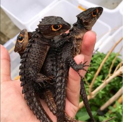
When it came to secondary forms I already had a scheme in mind, but was delighted to find The Red Eyed Crocodile Skink for reference. Superficially similar to the crocodilians, this little lizard has scutes with more character to them – more of a profile. They are simple, elegant forms which lend themselves to adaptation. I had some depth maps I wanted to use for the skin texture, so I wasn’t going to I ended up only using the overall pattern of the scutes, and blunted them down to give a smoother profile.

When it was time for “tertiary forms” I used these depth maps I made from a gumroad frog scan a while back. Using depth maps for skin texture is not as simple as slapping them on a mesh, though; to use them correctly requires morph targets, layers and careful masking. Different depth map alphas will have varying contrasts and their borders will therefore have different depths. Not only do depth maps have to correspond topologically with each other; the information they contain has to seamlessly line up. Also this information must logically correspond with its placement on the mesh (finer, shallower wrinkles and scutes on thinner skin).

The colour scheme of any model will always have a malleable relationship with the sculpt, in that both carry information in different ways. A wild, detailed paint job will obliterate a detailed sculpt, for instance. Conversely, a simple diffuse texture done well can really complement a sculpt. Finally. a simple sculpt can really be enhanced by a brave, well-executed colour scheme. I chose a colour scheme that was halfway there – very subtle where the sculpt had something to say, and a little variety where the secondary forms weren’t doing much.
And that’s about it for now. I want to write about optimising a mesh like this for real time rendering, and more about design – specifically the distribution of information around the form (even composition in general), but this one seems to be an elusive subject – there isn’t really a lot that’s readily available, even beyond the paywall.
