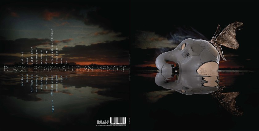
Last Summer I had the pleasure to work with ethereal Montreal-based troubadors Black Legary to create their debut album cover. It was one of those projects with the magic mix of mutual flexibility and shared vision, and resulted in a graphic suite with quite a satisfying eyefeel.
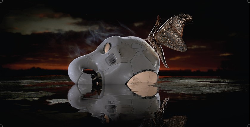
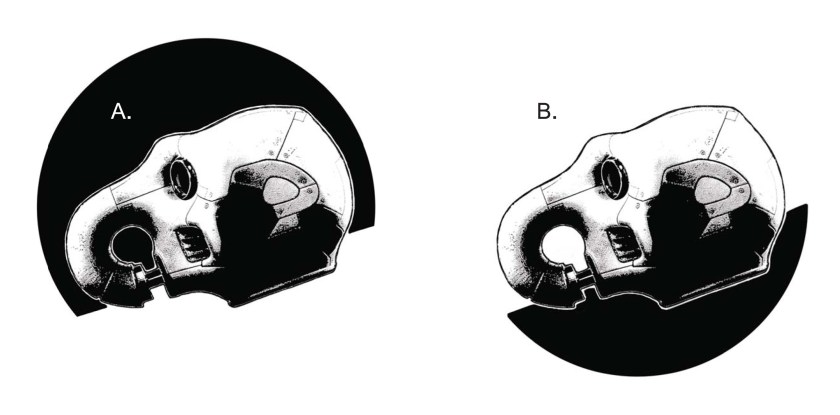
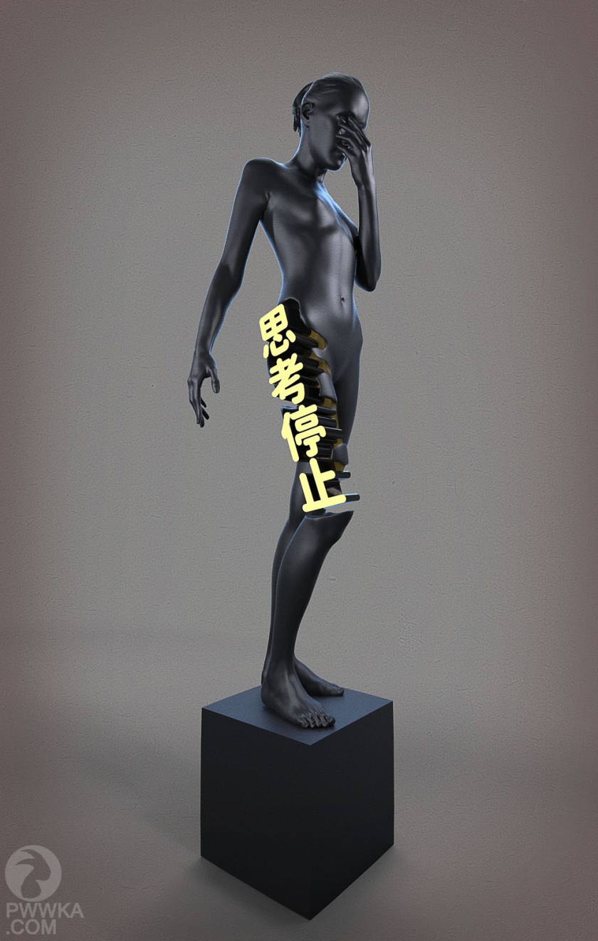
The pale proboscis-mask began life in a notebook somewhere, and I developed it into a model at some stage purely for kicks. In and of itself it was a form which seems strong enough to have caught the client’s eye, and the rest of the concept grew from there.
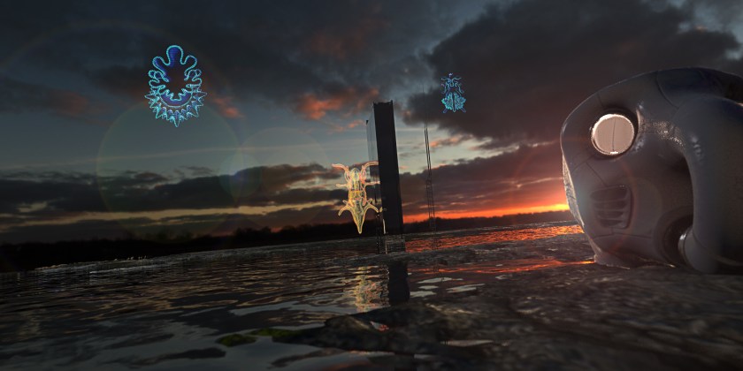
These are a few of the early iterations that were mooted. Early on it was agreed that technological elements would be balanced with the primordial (“Silurian Memorii” is the album title), and gritty darkness would be countered with light of some sort. It was a lot of fun playing with the reflective properties of the primordial pool, but ultimately these fancies were greatly restrained, and the main light sources would be the “dawn” backdrop and the interior light of the headgear itself. “Silurian” is a geological term, but as an epoch that frames some of the earliest life I felt a reference to biology wouldn’t go astray.
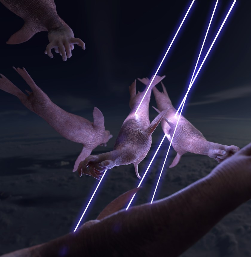
The moth is an animal which occupies a strange place in culture, I think. It is both cute and grotesque: its furriness makes it tactile, but this is immediately juxtaposed with the inherent alienness of the insectivora, resulting in a wee contradiction of a beast. The above renders were explorations into ways of having the moth form be the vessel for the light element of the image. The client had a brainwave at this stage and asked if I’d seen “Clash of the Titans”, and if I remembered the gilded little owl. “You mean Bubo” I said, and a final look for the moth element was thereby settled on.
For the back cover I wanted to continue the theme of the front: I’ve always liked the holistic satisfaction of pursuing a theme down through all the little information deliveries such as track list and lyrics etc., and I felt there was potential for a wraparound concept.
The idea was to have the information suspended in the landscape, almost like a readout display of some sort. I felt it was a nice way to frame the geological and biological elements from the front cover while delivering information in a striking way. The design that was ultimately settled on largely eschewed the “floating in situ” information block and instead incorporated the horizon line of the scene into a loose grid. The vertical track list is reminiscent of a graph, so I felt it still retained a little science-fiction-ality.
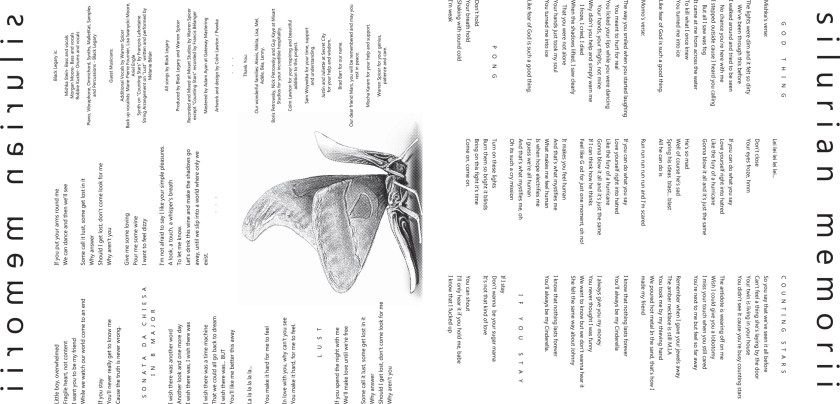
Above are both the simple design settled on for the vinyl pucks and the inner sleeve liner notes. I felt all elements needed to be quite simple now – any fussiness or noisiness would detract from the lushness of the cover imagery. Below are the pages of the digital booklet, which expand on the cover imagery using different lighting setups. Believe it or not, this is the most pages I’ve had to balance type layout over: I’m not sure I have the natural constitution necessary to handle much more text in one go…
Finally, it was felt that there was potential for more graphic content in the form of a foldout poster, so I set about coming up with some imagery to use. 
Ernst Haeckl’s “Kunstformen Der Natur” has an endless supply of gorgeous renderings of various life – forms which I thought suited the theme of the project. I added some architecture and, with judicious use of lighting, ended up with some visually arresting imagery with just the right amount of mystery to it. In the end I think it was felt to be a bit much, and the poster design we went with was a rendering variant on the cover.


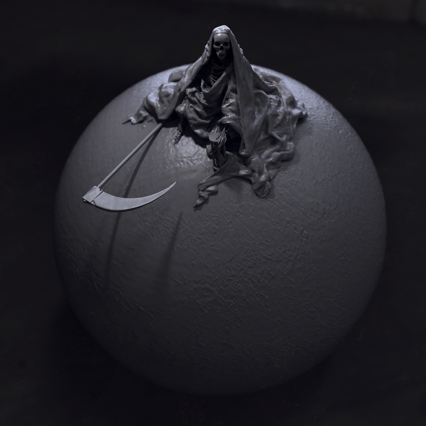 An old model which I thought would be fun to run through the Keyshot mill to see what came out. The original is by Doré (below), and although this interpretation doesn’t really add much it certainly was fun to work on.